
Journal Preview
I'm a hardcore data nerd. And I love spreadsheets. I use them for just about everything, including my running journal (which has expanded to include cycling as well). Tracking my successes and failures has helped to keep me motivated. I know that this is true for many others, which is why tracking apps (like Strava or MapMyRun) are so popular. I use those apps to record my activities, but I always put the data into my own spreadsheet.
I've used Microsoft Excel for this, but I'm planning to shift over to Google Sheets and "open it up" to be publicly available, as a template for others to use. Just one of the many goals I have for Legs Mis, to help people stay on track to meet their fitness goals.
Not only do I track runs in a table (like the first image), but I also have summary tables that calculate weekly, monthly, and yearly statistics, event results (5k, 10k, etc.), gear used, and more.
As I've "plateaued" or "stumbled" during my training, I've tried to find new ways to look at the data to motivate myself. So my journal has been a big work-in-progress for about 2 years now. And I'm still making adjustments. Right now, I'm trying to figure out a simple way to calculate negative splits (total time during first half of run compared to total time during second half of run). The goal is for the second half of a run to be faster than the first.
I've shared some screenshots below.
Screenshot #1
Example of the "easy runs" table, showing some of the data columns. I've left off quite a few, such as heartrate zones, mile splits, course description, etc.

Screenshot #2
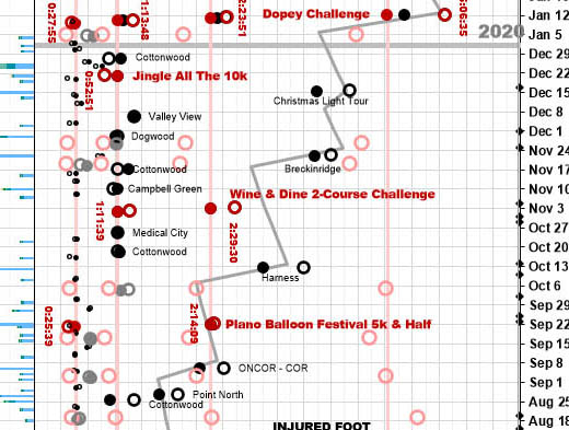
Example of the chart showing all runs and associated data (e.g., cold/hot temperatures, and total elevation change). Open circles = total time, filled circles = total distance, small circles = "easy runs", large circles = "long runs", red circles = events, gray circles = "magic miles" and pink circles = predicted race times

